Howard Health
Howard Health
Find out how we created the Howard Health brand, crafting a bold identity and digital experience designed to signal authority in the modern fitness space.
Year
2022
Scope
Full-service
Client
Howard Health
Duration
1 month
The Challenge
Howard Health was founded on a simple but demanding belief: real results are earned through consistency. As a modern performance and personal training brand, the ambition was to create an identity that reflected discipline, progression, and measurable growth — values deeply embedded in both the training philosophy and client experience.
The challenge was to develop a brand that felt unmistakably strong and contemporary while standing apart in an increasingly saturated fitness landscape.
The Solution
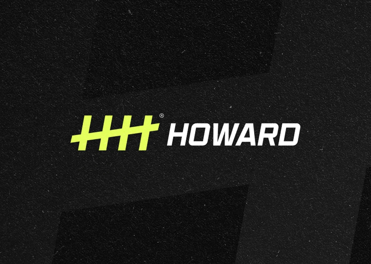
We crafted a strategic identity centered around a powerful visual idea: tally marks — a universal symbol of repetition, effort, and progress. By merging two H letterforms into a rhythmic strike, the mark captures the essence of the Howard Health methodology: results built through persistence.
The visual language was intentionally minimal yet high-impact. A monochromatic base, energized by a sharp accent color, creates immediate recognition while reinforcing the brand’s performance-driven character. Paired with bold typography and structured layouts, the system communicates clarity, strength, and forward momentum.
Beyond the identity, we designed and developed a high-performance website, translating the brand seamlessly into a digital environment. The result is a cohesive experience that guides visitors with confidence while reflecting the professionalism behind the coaching.
The Result
Howard Health launched with a bold and disciplined brand foundation — a clear identity designed to communicate strength, structure, and measurable progress. From the tally-mark symbol to the digital experience, every element worked together to position the brand with authority in a competitive performance market.
The project stands as a testament to the power of strategic clarity and intentional design — demonstrating how a strong identity can translate a training philosophy into a compelling and recognizable brand.


